It’s long been said that a picture is worth a thousand words. I think it’s necessary to have a few diagrams to show the BizTalk flow of any application. I’m not happy with UML, because they don’t show the many aspects of BizTalk. I’ve walked into companies before that had no diagram, and the first thing I did was to create one. In the process, I learned the flow of the system, and I document it for myself and others. I often pin such diagrams to my cubicle or tape them to my office wall, and refer to them frequently. They are constantly used in meetings to explain steps and processes to managers, users/customers, and/or other developers.
Ideally, the diagram should include:
1) Some key filenames (or at least partial filenames, as the paths are going to be different from development to QA to Production) 2) Key programs (orchestrations and any C# programs)
3) BizTalk Send/Receives
4) Any touchpoints with existing in-house systems or external trading partners (vendors, customers, etc…)
Here are some of the shapes and colors I’ve been using as part of standard Visio:
1) Light Yellow Parallelogram – Receive or Send Port – If relevant, I often include a map name or pipeline on the shape.
2) Blue Rectangle – Orchestration
3) Disk – Disk
4) Database – Database or Tables in Database
5) Cloud – Internet (FTP or HTTP access to outside company)
6) Red Rectangle – Pollers (C# programs that read database and create XML files)

NOTE: There is a package of Visio 2013 Stencils for BizTalk (by Sandro Pereira). I have not yet used them, but they relate to representing Biztalk Server physical architectures, integration architectures and solution diagrams.
I’ve also used http://Draw.IO, as sometimes, not everyone has access to a license of Visio.
The following is an example from a larger project where we were processing a variety of Rosetta Net documents. The diagram also includes the project management number for each task (this company was using a system called “Redmine“). In the example below, I wanted to emphasize some of the logic of the orchestration, and I had room, since I had was putting only one or two Rosetta documents per page. I also included the name of the developer working on in the header (removed from diagram below), as each developer was working on maybe 2-3 Rosetta documents.
Here are some of the shapes and colors I’ve been using as part of standard Visio:
1) Light Yellow Parallelogram – Receive or Send Port – If relevant, I often include a map name or pipeline on the shape.
2) Large Green Portrait Rectangle – New Development Orchestration for this application [all it’s main logic is to the right]
3) Green Landscape Rectangle, Diamonds, etc… – Steps in the orchestration
3) Cylinder – Disk and DB
4) Blue Rectangle – This was an existing orchestration that we share across applications
5) Purplse Hexagram – Pollers (C# programs that read database and create XML files)

There is also a free tool called Biztalk Documenter. It’s project description says:
This tool creates documentation for a given BizTalk server 2006, 2006R2 2009, 2010, 2013, 2013R2 or 2016 TAP installation. This project has used the source code of the original BizTalk 2006 Documenter , updated and improved it. We have also added the SSO documentation by the Red Eyed Monster from the BizTalk 2010 documenter
The related bog is “Documenting Your BizTalk Solutions“. That blog has a full set of screen shots to show you what comes out of this tool.
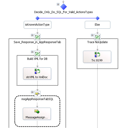
When I’ve had one or more long complicated orchestrations, that need extra documentation, I have used TechSmith’s SnagIt to take screen shots, and paste into a Word document. Then I write paragraphs of text in the document describing what needs further clarification. Unfortunately, BizTalk Orchestrations don’t have a “text” or “doc” shape. I often use “Group” shapes in BizTalk Orchestrations to provide additional documentation “inline”, and I even nest them if I need more text than will fit. I also put long text on the Decide shapes if that is helpful. Here’s an example:
There are advantages and disadvantages to both manual and automated documentation. Obviously, the automated documentation can be updated any time by just re-running it. But it is usually bulky and sometimes too detailed, and much too large to print. I’ve always preferred or one or twp page diagram that summarizes the whole system with “the big picture”. As of yet, I think only a human can do this. Part of the art is when to abstract – i.e. what to include in the diagram, and what to leave out. If you try to include too much, you will end up with 3 to 5 pages of diagrams and then you can get lost in the detail. If you omit too much, then the diagram may be of little value. It’s even possible that you might want both, a very high level diagram for management, and then a more detailed diagram for architects and developers.
Neal Walters has been work exclusively with BizTalk since the 2002 release, and has both been a Microsoft Trainer of BizTalk and a consultant since 2004. He is now developing a Dallas SEO agency (Search Engine Marketing).